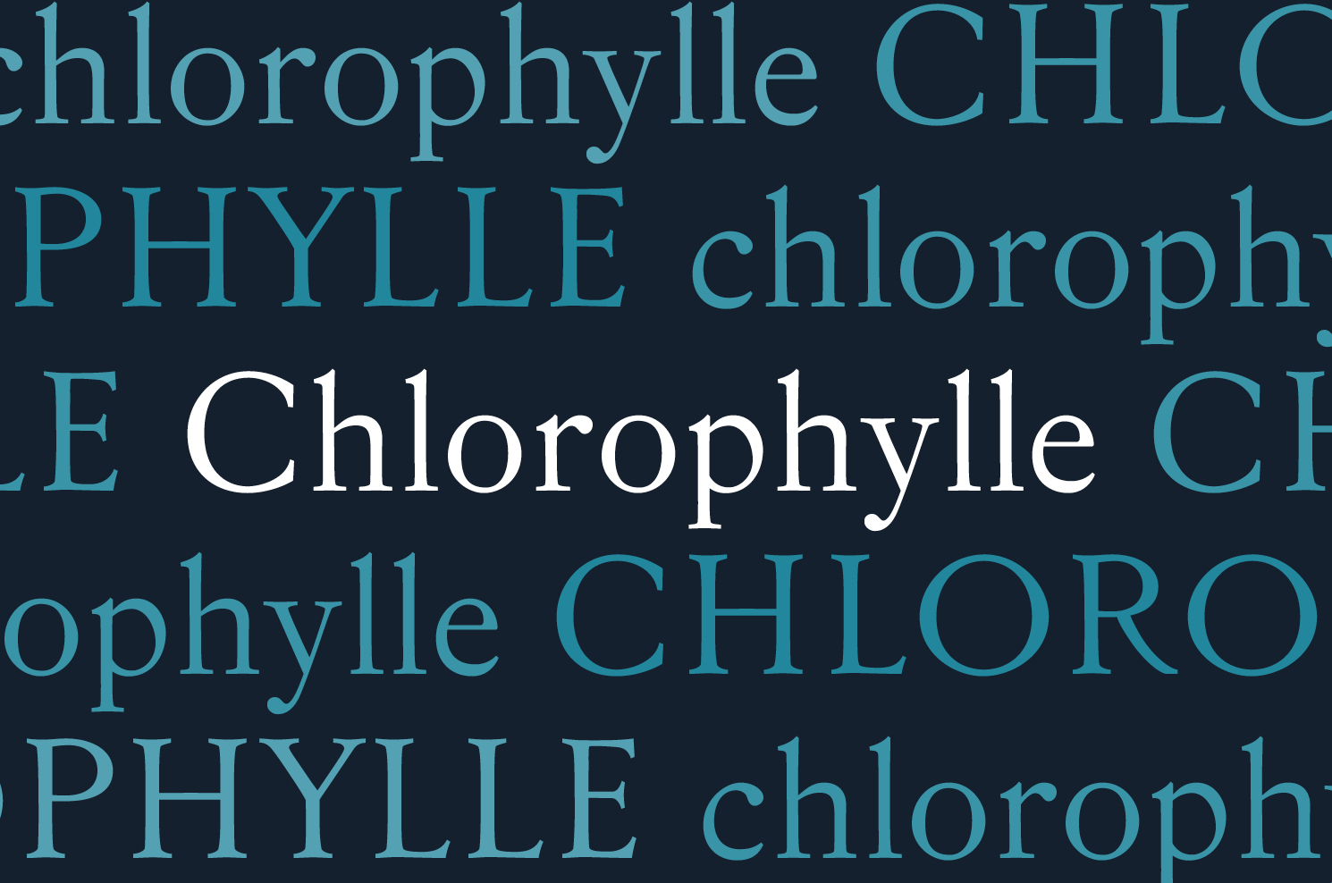
Chlorophylle
Typographie
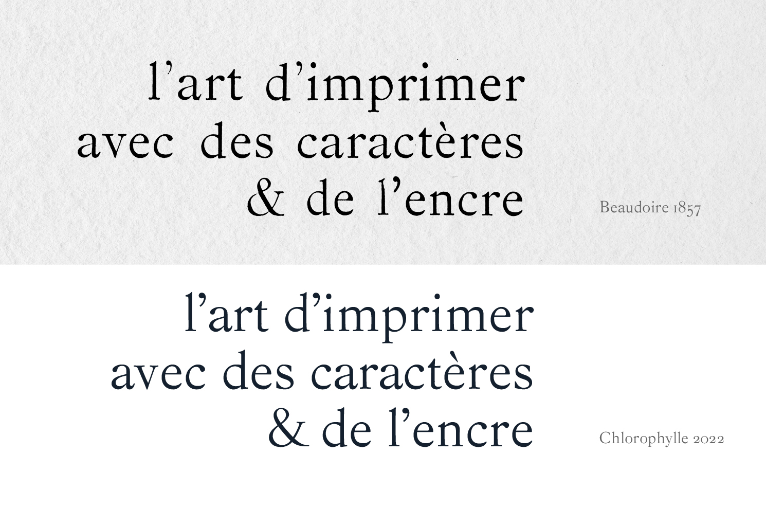
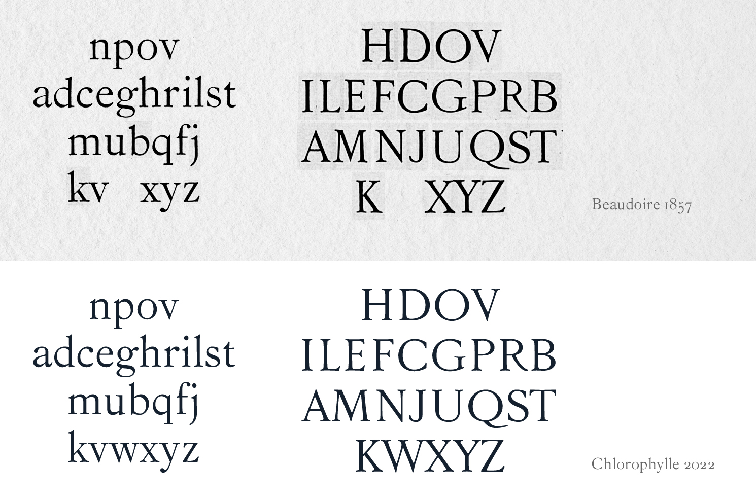
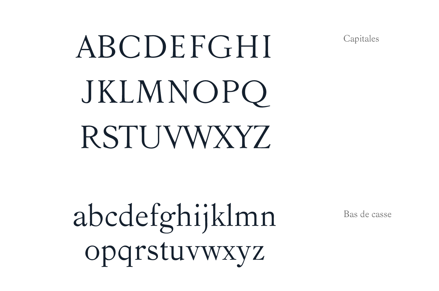
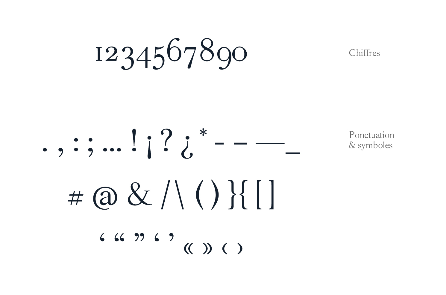
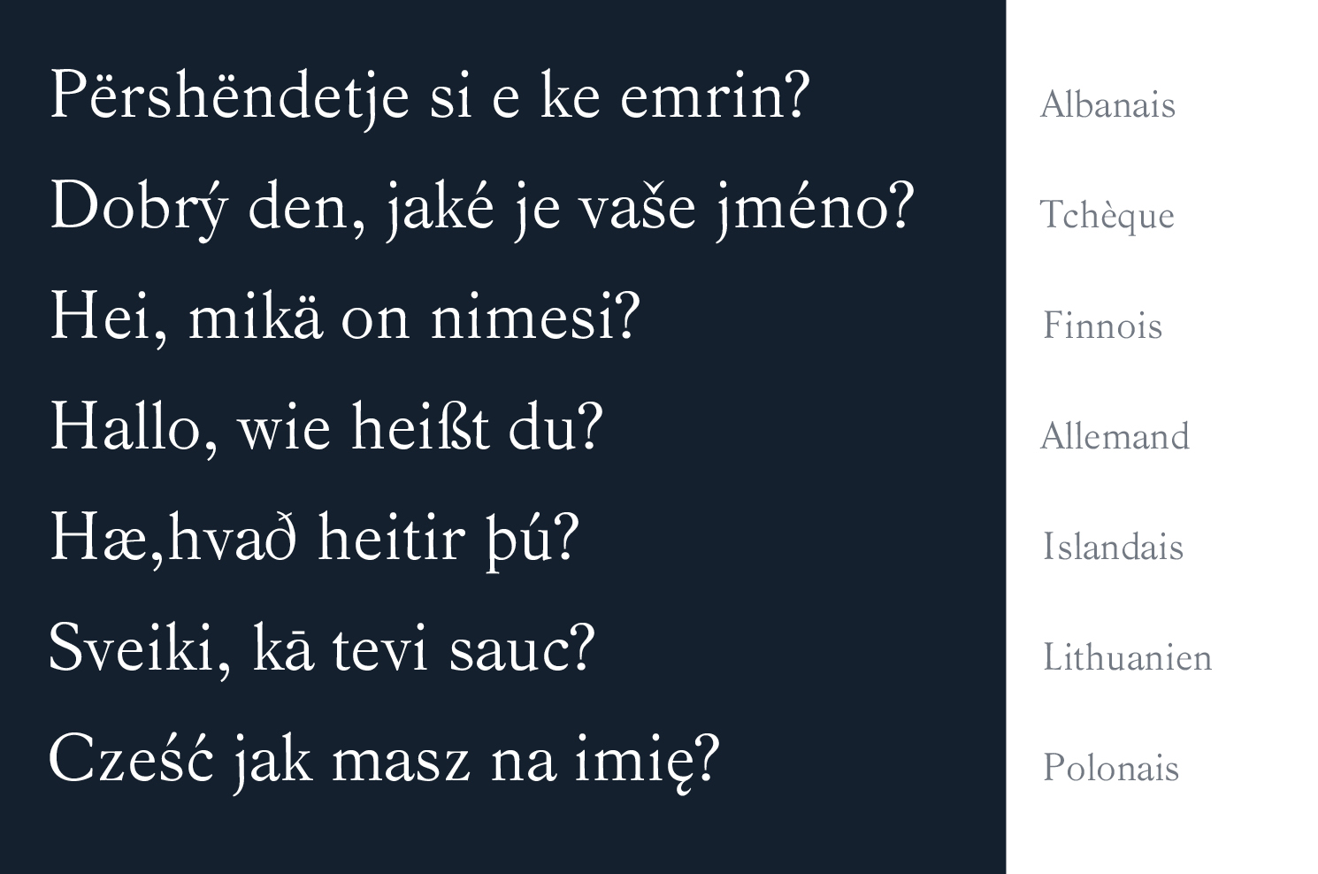
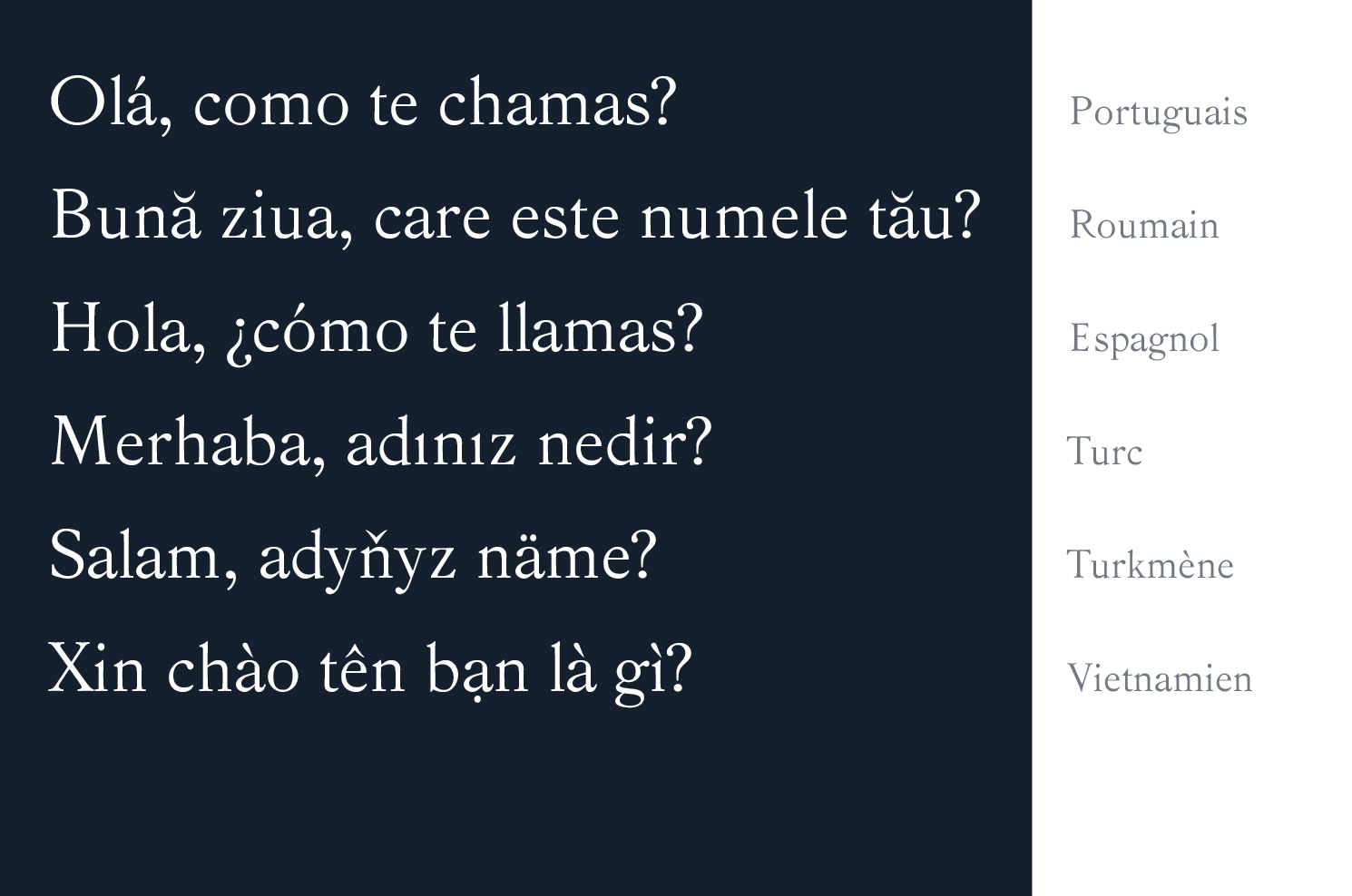
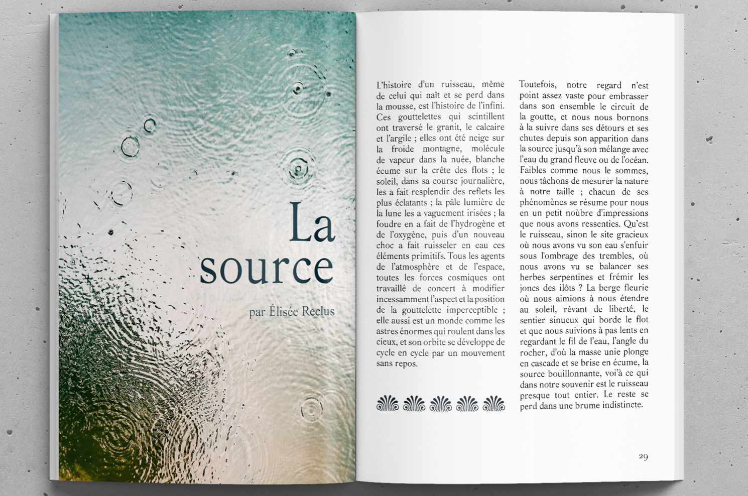
Blossoming from the 1857 typeface Beaudoire, Chlorophylle is the typeface that sharpened my eyes and my thoughts during my first term at Type West. Among all the options my research brought me, Beaudoire seemed to be at the same time a pleasure for the eyes, and comfortable for readers.
Théophile Beaudoire created his typeface at a time where the characters of Bodoni and Didot began to tire professionals and readers because of their high contrast. He was inspired by the characters printed earlier by the Elzevier family in the Netherlands. Their characters were first created in the 17th century, for technical reasons: they were intended to facilitate the printing of small books, able to circulate easily, even if they were prohibited. Realizing the political and cultural impact a typeface can have fascinated me.
Reviving a typeface for today’s use is a filtration process. A process that reminded me how plants filter light and water to produce oxygen, that’s why I named my typeface Chlorophylle (yes, with two “Ls”— that’s the way to write it in French).
To see more about Chlorophylle
Category
Lettering & type